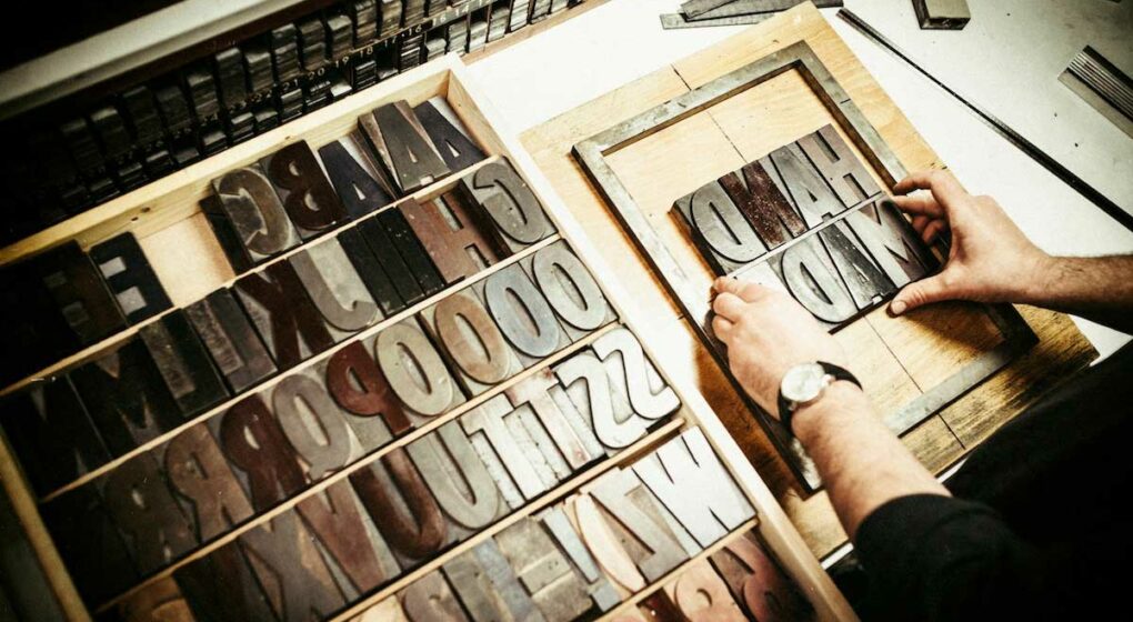
Designing an effective package is a monumental task. There are so many pieces to consider. From sizing, to materials, to colors and imaging, it’s easy for something as simple as fonts to get overlooked. But not here at Ethos. In fact, packaging fonts are a favorite of self-professed “font geek” and senior designer Jessica Laracy.
“There is a whole culture of font geeks among designers,” says Jessica. “Typography really is an art in and of itself. You can express so much with just a font and nothing else.”
So how to find the perfect font? Here are Jessica’s five top tips:
-
Don’t Be Standard
When it comes to packaging fonts, the goal is to stand out on the shelf. So steer clear of basic fonts that tend to blend in. Ideally, you can find a font that acts almost as a logo for your product. Something unique enough that when a customer sees the font they immediately think of your brand. It can be tough to do this with just a basic fonts package – so think outside the box and search sites like myfonts.com, fonts.com, or even fontsquirrel.com, which has a database full of free fonts. Jessica also mentions that sometimes lifestyle bloggers will showcase and offer unique fonts on their personal websites as well. Always make sure, however, that you have the appropriate license to use a font on a package. Most fonts are inexpensive to buy, ranging in cost from $10-$30 for a singular font, and up to $100 for a family on fonts (light, bold, semi bold, italic, etc.). If you’re really having trouble finding the perfect typography, you can also hire a custom illustrator to create a font specifically for your package, or customize an existing one.
-
Let the Font do the Talking
One of the key aspects of choosing a font is choosing one that does the talking for your product – not just through actual words but also in the typography itself. For example, if you’re selling protein powder, you’ll likely want to choose a sans serif font that is strong and bold – something that conveys power and strength. If you’re selling candy, perhaps you’ll opt for something more fun and whimsical. Consider your target audience and the “type of type” that will catch their eye and capture their attention.
-
Find the Right Match
Finding the right primary font is the first step – but most package designs require multiple fonts that all work together under a hierarchy. Once you select your primary font, begin searching for compatible fonts that compliment (without overpowering or distracting) from the primary typography. A good rule of thumb is if your primary font is a serif font, the secondary should be sanserif, and vice versa.
-
Evaluate in Context
When you’re searching for fonts make sure you’re not just using the classic “abcdef” to decide whether or not it works. Always evaluate fonts in context, that is, input the actual words that will print on the package into your fonts program and search through the various fonts with those specific words. Some fonts have unique details on certain letters, or the letters fit together differently in various combinations, so it’s important to evaluate the font with the actual words you’ll be using it for.
-
Keep an Eye on the Rulebook
While searching for unique fonts can be a fun task, it’s also important to keep one eye on the rulebook. Certain products have strict packaging requirements that can rule out certain fonts or types of fonts. For example, most nutrition panels on food products are required to use Franklin Gothic Heavy or Helvetica Black. Font sizes are also regulated for many packaged goods – so be sure to consult the appropriate guidelines before finalizing your font choices and package design!
Choosing the right font for a package is equal parts creative and strategic, and certainly not an element to be overlooked. Like many marketing decisions, there are no right or wrong answers…just fonts that blend in, and fonts that stand out. The bottom line? Choose a font that embodies your brand and grabs attention on the shelf.
About Ethos
Ethos is a multiplatform branding agency that develops and executes integrated marketing campaigns across multiple channels for companies inside and outside Maine.
At Ethos, we believe that the most effective way to set a company’s marketing course is by finding its core truth – it’s ethos. We know that once we discover and communicate that core truth, we can truly make a difference to each client’s unique marketing and business objectives.
With Ethos, you get more than a Maine branding agency. You get a long-term partner whose goals are your goals.
Learn more about the Ethos approach and the work we’ve done for our clients. Want to have a conversation about your brand’s core truth? Contact us!

