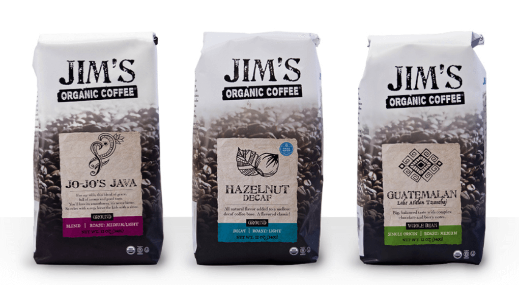
Growing great coffee takes incredible patience. Kind of like growing a great business. Jim Cannell of Jim’s Organic Coffee knows that better than anyone. He had already been grinding away (pun intended) at his innovative organic coffee roasting business for more than 20 years before deciding to make the investment in an updated brand identity – something that would reflect the exceptional quality of his product.
And boy did his investment pay off.
Just six months after rolling out the new website and packaging, same store sales in all major accounts grew more than 30%. The top retail account was up 37%, and top natural foods retail was up over 50%. In every case where he had instituted the updated branding, account sales were up, compared to flat sales in food service accounts that were slower to implement the new identity and package. It’s hard to argue with those kinds of numbers.
But the success of Jim’s new look wasn’t a coincidence, or an accident. It came after months of diligent research, careful planning, and following these 5 steps to re-branding success.
1. Find Your Core Truth
When it comes time to re-brand, before you even start to think about design, you’ve got to find your brand’s “core truths.” These truths are your reasons for being – the things that make your business unique. When Jim’s came to us for help with their re-brand we started by diving deeper into their business and uncovering the things that made them special – like the incredible care they took to procure, roast, and brew the absolute most delicious cup of coffee. To Jim, coffee was an art form. It was coffee with character.
2. Do Your Research. You might be surprised what you find.
Once you’ve identified your brand’s core truths, it’s time to find out how potential customers think and feel about them. The things that you assume motivate people to buy your product could be very different from what actually catches their eye. In Jim’s case, our research was critical in understanding how people think about and categorize organic coffee. It turns out that organic means something very different to coffee lovers than it does to organic buyers in other categories. While most organic consumers are motivated by a lack of pesticides, artificial ingredients and protecting the environment, those were not the driving factors in the coffee category. The coffee lovers we interviewed said their coffee needed to reflect their individual tastes. The value of organic to coffee lovers was less about ingredients and environmental sustainability and more about taking the time to do things right and to create truly delicious coffee worthy of their morning cup.
3. Design Your Brand, Then Your Package
Before you can even begin to imagine a new package, you’ve got to nail down your brand’s DNA – a document that marries your core truths with the specific things consumers are looking for. Once you identify this cross-section, you can begin to outline your brand promise, personality, core values, brand pillars and messaging platform. Once that is complete, it’s time to translate the Brand DNA into a visual look.
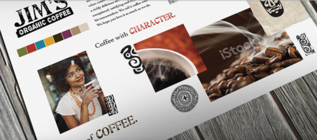
For Jim’s, the brand identity evolved out of what we call “brand mood boards.” Mood boards are essentially collages of images, graphics, design elements and phrases that come together to convey a unified brand look and feel. After piecing together multiple mood boards, and then narrowing with the client, we were able to choose one direction and expand on that brand look further, creating mock ups of various important visual identity pieces such as packaging, collateral, point of sale, a website wireframe and more. In this case we leveraged the idea that the art of good coffee comes from patience, and taking the time to do it right yields a coffee with character.

4. Map the Old to the New
Often a new identity can create a short-term dip in sales before the new package takes hold and accomplishes the sales growth goal. Consumers are creatures of habit and pick up that which they recognize. When they don’t see what they’re looking for, they often grab that which is familiar – potentially a competitor. It’s important to understand which visual cues and equities resonate with existing customers before any new package is launched. Including these visual cues on the new package can help map customers to the new brand identity quickly and efficiently. Common examples of visual cues include the brand logo, key design elements, color schemes, or unique SKU delineation strategies.
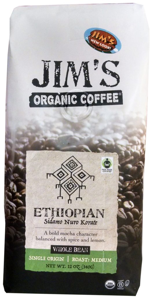
In this case, our research identified two equities: The name “Jim’s” (which we clearly delivered on in the new package), and an illustrated brown cartoon bean with a blue sky background that were not included in the new look as they were deemed to erode quality perception. To help consumers, a simple transition sticker stating “Jim’s New Look” was included on the package for a transitional period.

5. Commit to Change
Change can be disruptive – even positive change. So listen to your customers, but don’t let a few negative comments derail you. In the case of Jim’s Organic Coffee, the brand had a few exceptionally loyal followers, but was in need of a refresh to truly realize their opportunity. Remember, it’s not just your package. To restage a brand requires an understanding and inventory of all consumer touch points. These can include your website, point of sale, trucks, social media…even how you answer your phone. Consistent execution builds brands within the strategic identity. In Jim’s case, sales went up almost immediately and the new package, website, and point of sale were well received. If it takes a little longer, maintain your resolve and commit to it.
When it comes to re-branding it’s important to think about it from your consumer’s perspective. Often, brands get sick of their look and messaging long before their customers do. So when you do decide it’s time to switch up your look, make sure you truly understand the strategy behind what you are trying to accomplish before design begins. Let your core truths, brand promise, and consumer research guide you.
Read more about the work we did for Jim’s Organic Coffee here.
About Ethos
Ethos is a multiplatform branding agency that develops and executes integrated marketing campaigns across multiple channels for companies inside and outside Maine.
At Ethos, we believe that the most effective way to set a company’s marketing course is by finding its core truth – it’s ethos. We know that once we discover and communicate that core truth, we can truly make a difference to each client’s unique marketing and business objectives.
With Ethos, you get more than a Maine branding agency. You get a long-term partner whose goals are your goals.
Learn more about the Ethos approach and the work we’ve done for our clients. Want to have a conversation about your brand’s core truth? Contact us!

